All images in this article courtesy of NASA.
I first started working with 3D computer generated illustrations on the Commodore Amiga in 1986. The first good rendering program was Sculpt 3D. The basic principle is to take a 3D object file, basically a geometric object made of polygons, attach textures, set up lighting and environmental features and select Render. Due to the technology at the time, I had to run my Amiga all night to get a simple rendering of basic objects. It was a fun and experimental method of artistic exploration that only the people at major studios could do at the time, making its way to the masses at home for the first time. It was art not made by hand—instead the computer did the drawing and painting. Later, when I started my career as a stock photographer I also incorporated CGI (computer generated image), though by now rendering with much faster hardware, into my portfolio.
Fast forward to 2024 and the CGI has gotten to the point of hyper-realism as seen in such films such as The Lord of Rings, Avatar, and a host of sci-fi films and TV shows. Having a background in photography and CGI I think I am well versed in spotting what is real and what is not. And much coming out of NASA and the Jet Propulsion Lab (JPL) of late is obviously fake. Have you seen the NASA image of North America much larger than its actual size? Or of North America totally in green with no desert areas or snow capped mountains? It’s all out there. I fail to understand why with the sophistication of cameras and software to transmit pictures back to earth, they would resort to this nonsense.
If what they are doing is real why fake pictures?
The Lunar Reconnaissance Orbiter
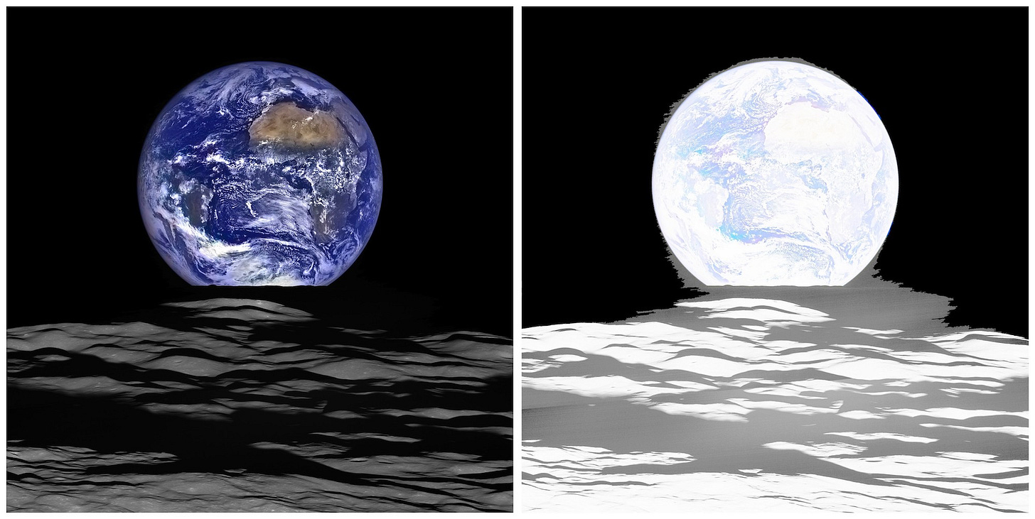
This image is allegedly from NASA’s The Lunar Reconnaissance Orbiter or LRO satellite launched in 2009. Its primary mission is mapping the moon in an eccentric polar orbit. This includes imaging the NASA Apollo landing sites and future landing sites for human and robotic exploration, besides a wealth of data acquisition.
So it’s odd that this mapping satellite would be used for space photography. However, this image of an “earth rise” from the moon’s surface contains a host of problems. Since the earth is three times larger than the moon, it certainly isn’t 50 times or more. The earth in the image is simply too big, massively so to be authentic. After punching up the gamma, the flaws really start to appear, especially with the noise around the earth’s edge. It's apparent from experience with CGI, this is computer rendered art and not a photograph.
A case in point is the jag seen on the edges in the image below. This is fixed by using a rendering app that has a feature called anti-aliasing to render smooth edges. This may add to the rendering time, but can be worth it for a smoother, more realistic image. It clearly wasn’t done here.
This incident also shows the poor vetting that space, science and technology media publications and websites carry out. They give NASA a pass on practically every issue and often repeat by rote whatever is handed out to them. Shouldn’t journalism be more than cut-n-paste press releases?
Apparently it’s easy to fool these science journalists such as Samantha Mathewson at Space.com. She is one of many writers on numerous science sites that fell for it. Actually, journalists working for corporations have restrictions on what they can investigate that we independents don’t have. I can see them all falling into line.
Eventually NASA did fess up, which unfortunately, is rare.
Using Digital Imaging In Illustration
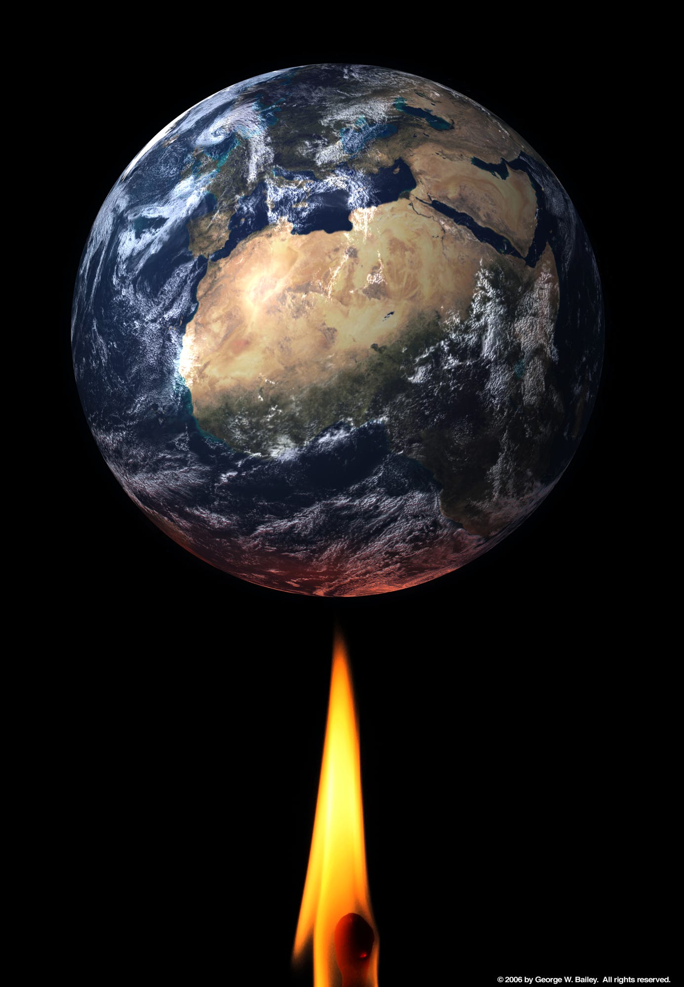
This image I created in 2006 featuring a global warming theme. It is a composite image, the Earth from NASA (public domain) and the flame a photograph of mine.
Is the Earth a NASA image? Yes and no. The Earth looks real enough but is a NASA digital construct. I didn’t download an image—I downloaded a data set and rendered it. The data came with a 3D object file of a sphere and several image maps, which scaled the image to fit on a sphere. One map features the ocean and the land masses, one map is the clouds and the last map is a grayscale image called bump map. The bump map adds texture to terrain features. They are overlaid on the sphere and the image is rendered. I added a picture of a candle flame in shot and assembled the composite in Photoshop.
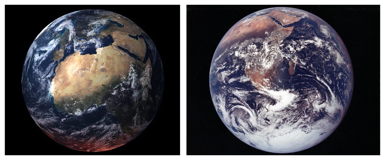
Nothing about this image of the Earth is real. It does, however, bear a resemblance to the earth image shot by astronaut Harrison Schmitt on Apollo 17 in December of 1972. Notice the comparison between the two. My rendered image is too clean looking (a telltale sign of CGI) compared to an actual photograph by Schmitt. It has the look of film. (One oddity though is that the aura australis on the south pole is not visible. In fact, neither of the auras are visible on any Apollo images I have examined. They are not seen in images from space till the advent of the International Space Station.)
The InSight Lander
Launched from Vandenberg AFB on May 5, 2018 and landing on Mars on November 26, 2018. It was engineered for a 2 year mission and made it 4 years before NASA ceased its operation largely due to dust buildup on the craft’s solar panels.
As stated by NASA, “InSight studied the deep interior of Mars and was designed to take the planet's vital signs: its pulse, temperature, and reflexes. InSight was the first mission to give Mars a thorough checkup since the planet formed 4.5 billion years ago.”
Instrument Context Camera (ICC)
As seen above the early images arriving from the InSight lander on Mars shortly after landing has concerns. The first image broadcast to the world came from the lander’s Instrument Context Camera (ICC). It features a filthy image, barely in focus with large spots on it described as dust. The color and lighting are awful. The horizon is distorted into a hoop by an extreme wide angle lens. The is a disappointing image, taken with an expensive digital imaging device that does not look as good as images made over a 100 years ago on Civil War battlefields. Regardless, the ICC is most likely the only real camera sending home photographic images. (Notice that the ICC image feature a slightly blue sky.)
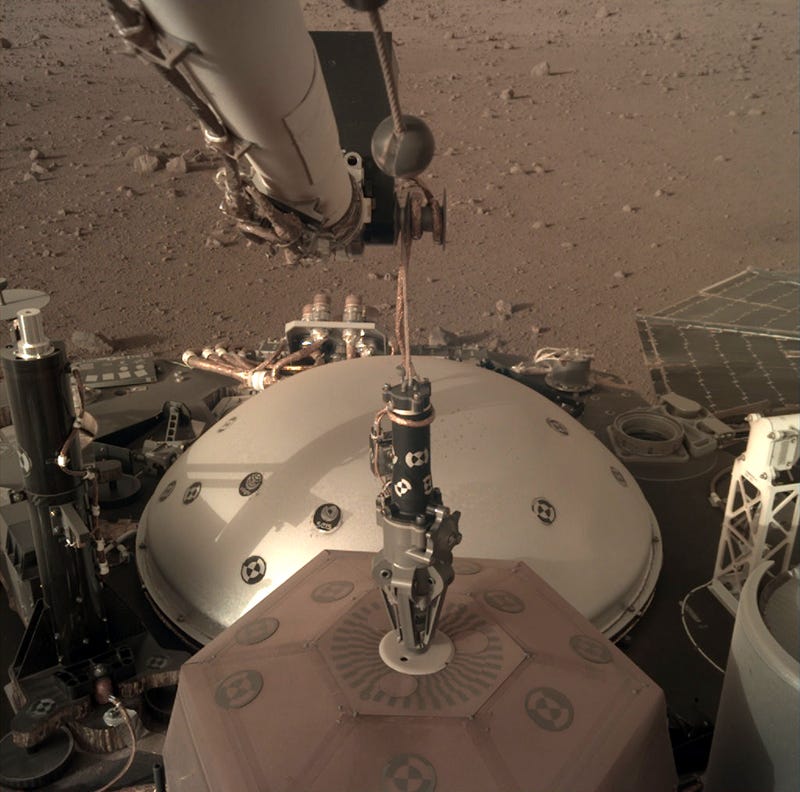
The rest of this section will be about the second camera, the Instrument Deployment Camera given its radically different look in its images. I will not declare the IDC images are digital fakes but they do share the common appearance of a digitally rendered image. They do not have a “photographic” look to them. They have no life.
Instrument Deployment Camera (IDC)
The IDC images from the second camera are a radical improvement over the ICC images. The resolution, contrast and overall sharpness look fantastic. No crazy distortion of the horizon and even more importantly, no dust spots on the lens. Also of note is how the faded bluish sky of the ICC is gone and has been color corrected in the IDC images to a dusty Martian sky of the same shade as the ground cover.
Quite simply, these IDC images do not have the look of photographs. They look too sharp. A CGI will be, as stated above, too pristine looking. A real camera with the best sensor will never reproduce an image as sharp as the eye will. There is only so much resolving power between optics and a CCD sensor.
Another issue is the Depth of Field (DOF). All images are super sharp from foreground to background. When shooting wide open spaces, such as landscapes, this is not hard to do and only requires the proper focus and aperture setting (hyper focus distance). In macro photography, aperture is set for the focal point of the image, but often there will be some blur in various areas of the image plane. The IDC images feature mainly close ups of the various instruments and hardware on the lander. The zone of sharpness runs from the foreground to the background. In actual photography, there is always a trade-off between brightness and shadow; between focus and blur. These pictures feature no trade-offs at all.
Why does the IDC camera alway stay so clean of dust? No spotty images ever. The poorer quality ICC camera stays filthy. And while on this matter, why does the overall hardware of the InSight lander look so pristine? Mars is noted for having a dusty environment with its planet-wide dust storms. Not a speck of dust is to be seen on anything.
These pictures are billed as “raw” images. If so, where is the raw data? These images are missing both the meta data and IPC data. Metadata contains important shooting information such as ISO speed, shutter speed, aperture used, focal length of lens and so on. The IPC data is the color profile being used. Both are missing for both cameras. Why don’t they want us to know this?
Incidentally, a CGI rendering isn’t going to contain that data because the image is not being created in a camera.
So are the IDC images merely digital renderings? In many ways they remind me of the European Space Agency images of Mars. Those pictures have the same exact lighting and contrast giving them a very flat, unnatural look. They look like radar scans compiled into a 3D source file and then rendered with texture mapping applied. Just take a look at the early photos of Mars and compare them to these new hybrid creations.
Even more telling is how close these images look to the JPL animations and stills of the InSight spacecraft. Check them out on YouTube. It’s the same exact look. Same lighting, coloring, textures and no DOF blur.
There is nothing photographic about the last selfie.
Deep Space Climate Observatory (DSCOVR) Satellite
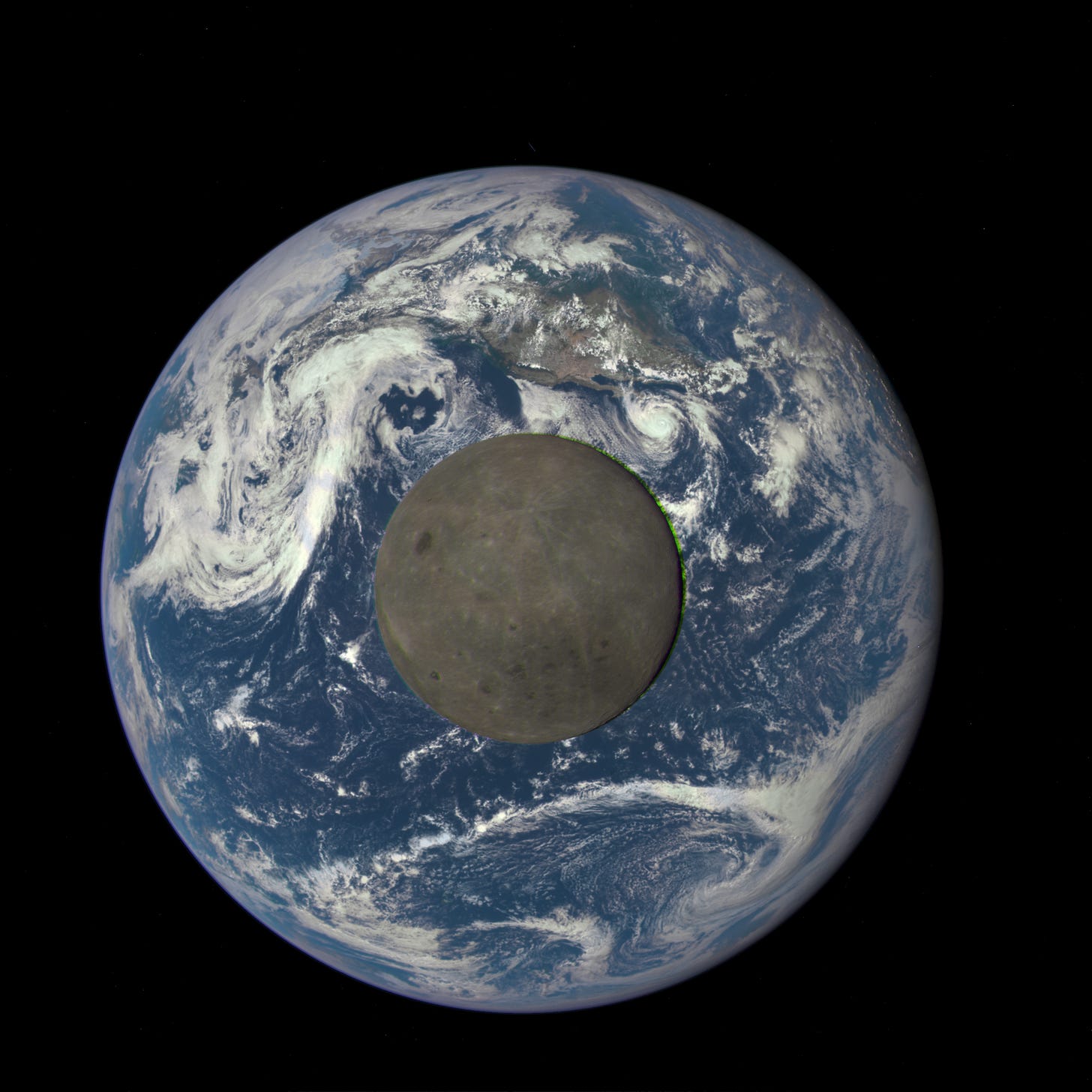
This is NASA’s moon (back side) crossing the earth with footage made from a series of frames shot at 30 second intervals.
NASA describes the DSCOVR satellite as “a spacecraft which orbits between Earth and the sun, observing and providing advanced warning of particles and magnetic fields emitted by the sun (known as the solar wind) which can affect power grids, communications systems, and satellites close to Earth.”
It doesn’t get any more fake than this. It’s hard to believe these images were captured by an actual camera. Everything is completely off. Like the LRO satellite this article started out with, the earth is too huge and too close in relation to the moon. The earth is rotating while the clouds stay the same, their patterns never changing. Each image of the moon is taken 30 seconds apart, or so NASA claims. It’s hard to believe the earth rotates that fast. Or for that matter, the moon’s orbit is that fast. What is the moon doing with a drop shadow? Since it’s 237,000 miles away from the earth there is nothing for a sliver of a shadow to fall upon. The lighting on the moon is particularly bad making the moon appear flat as a pancake. There is no depth at all. Go out on a clear night and look at the full moon and you’ll see what I mean.
An example of CGI done badly, it didn’t bother space and technology websites, they posted this nonsense as if these were real images and not a total fraud on the world and tax paying public. Are they in on this apparent cheat?
Here is another example:
In this image allegedly taken of the earth it seems like a large part of North America is located at the north pole. Florida is so far above the equator it should get a snowy winter! (Once again, where is the aura australis?) Another example of not getting their image mapping done correctly. This is why taking a look at the Apollo earth images will display how out of place and fake, these digital NASA images really are.
Endnotes
Many images sourced from NASA. Image use under CCL noncommercial usage and fair usage.
While the InSight had three cameras one of them was found to be not able to function yet NASA decided to launch with a failed camera anyway.
“Both MarCO CubeSats were also designed with a narrow-field-of-view camera, but MarCO-A’s narrow-field camera was found to be inoperable prior to launch.”
After much searching through NASA photo archives I’ve never found any photos of northern or southern auras in images taken from the Space Shuttle. As of this writing, the ISS has the only pictures known. The search for Space Shuttle aura images will continue.
The DSCOVR satellite uses an Earth Polychromatic Imaging Camera (EPIC), which is a 4 megapixel CCD camera attached to a telescope. DSCOVR orbits 1 million miles out from earth. The satellite has been placed in safe mode.
7.5.24
Close up of NASA’s famous Blue Marble earth image. After a long time they had to admit it was CGI. The close up shows the mistake made in mapping of the composite images. And once again, no Aurora Borealis at the north pole.
Sources
Science news website Space, claiming a CGI image is a photo.
https://www.space.com/40802-earth-days-longer-moon-movement.html
InSight Lander.
https://science.nasa.gov/mission/insight/science/
https://www.jpl.nasa.gov/news/press_kits/insight/landing/facts/
From a Million Miles Away, NASA Camera Shows Moon Crossing Face of Earth
DSCOVR satellite in safe mode.


